
California leads the nation in residential solar photovoltaic
installations. In fact, nearly half of all systems installed have been
in the Golden State. So why is California the leader? Sure,
California has plenty of sunshine, but there are many other states that
can compete on that dimension, including Florida, the Sunshine State.
It’s not the federal tax benefits, which are available to all US
residents. It’s not California’s Renewables Portfolio Standard, which
effectively excludes residential solar.
Some point to the California
Solar Initiative that gave rebates for new systems from 2007 to 2013,
and that is surely part of it. But another factor is the “solar
friendly” residential electricity prices. Not only do California’s two
largest utilities have some of the country’s highest average residential
electricity prices, the rates are also tiered, meaning that they
increase for additional kilowatt-hours as the household consumes more
over the month. As a result, large users face rates for much of their
power that can be three times higher than rates in many other states,
including the Sunshine State.
Have
the level and structure of retail rates been a major factor in
California’s residential PV boom? I’ve been wondering that for a while,
so in the last few months I’ve been sizing up the various solar
incentives for customers of Pacific Gas & Electric, the state’s
largest utility, which has by far the most residential rooftop solar
capacity in the country. The result of this work is being released
today in a new Energy Institute working paper, “The Private Net Benefits of Residential Solar PV: And Who Gets Them”.
Using
data on PG&E households that installed solar from 2007 to 2013 (and
for some data, into early 2014), I examine the collection of incentives
that were available, whether the system was bought by the homeowner or
owned by a solar company, known as third-party owners (TPOs). TPOs can
lease the panels to the homeowner or agree to sell the electricity the
panels generate under a power purchase agreement that specifies the
price per kilowatt-hour (kWh), usually for 20 years. I then put all
these incentives together with reported prices of the systems to
calculate the net benefits. The incentives include direct rebates
and tax credits, as well as indirect incentives from the structure of
retail tariffs and the credit for electricity grid injections from the
panels under “net metering” policies, as I’ve discussed in an earlier blog.
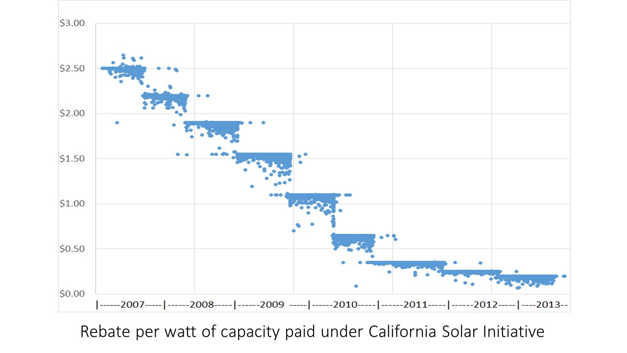
To
start with the easiest ones, the California Solar Initiative was
offering $2.50 per watt rebates back at the beginning of this period –
when the full systems cost around $10 per watt on average. The CSI
rebate stepped down over time, eventually hitting $0.20/watt in 2013
just before it disappeared. In the first half of 2014, the average full
system price was down to around $4.50/watt.
If
you bought the system, you got the CSI rebate. With a TPO, the company
that owns the system got the rebate and — I hope — you got a lower
price reflecting at least part of that savings. In either type of
transaction, how much the price adjusted to pass through the savings to
the homeowner, or how much the installer captured, is a point of strong
dispute. Different analyses have estimated 17%, 45% and 99% passthrough
rates to homeowners. Unfortunately, my study can’t unpack that even in
the simple case of system purchases, let alone with much more complex
lease or power purchase agreements. I estimate the incentive the
homeowner and seller jointly received, not how they divided it up.
At
the same time as California had the CSI, the federal government was
giving a 30% tax credit for solar, but only up to $2000 for the entire
system if a homeowner bought it in 2007 or 2008. TPOs got the full
credit from the start. Since 2009, homeowners have also had no cap on
the tax credit.
If you think figuring out federal tax credits
could get a bit tedious, imagine the thrill of analyzing the economics
of accelerated depreciation. I’ll spare you the details here (a phrase
that may have been more welcome a couple paragraphs earlier), but the
bottom line is that accelerated depreciation — which only TPOs can
utilize — amounted to an additional 12%-15% incentive, about half the
size of the 30% federal tax credit, and larger than the CSI since 2010.
The figure below shows my estimates of the size of these incentives,
all per kW of installed capacity, from 2007-2013.

That
brings us to the incentive from residential rates. During the period I
studied, the 5 tiers of PG&E’s rate structure averaged $0.13,
$0.15, $0.28, $0.37, and $0.40 per kilowatt-hour (kWh). The solar PV on
your rooftop crowds out the most expensive kWh first by reducing the
total kWh for which you get billed. Over these years, the systems
installed were on average displacing kWhs that would have cost the
customer an average of about 26 cents. Importantly, that is much higher
than the 19 cents per kWh they would have saved if PG&E charged a
single flat rate for electricity (that raised the same revenue). If PV
adopters expected the tiered prices to stay at those levels (adjusted
for inflation), I show that PG&E’s tiering of rates created nearly
as much additional incentive to install solar as did the 30% federal tax
credit.
The savings are so large in part because of net energy
metering (NEM), which means the household only pays for the net
consumption — that is, total consumption minus the electricity the
panels produce — even if some of the panel production gets injected into
the grid (which happens any time that the household consumption is
lower than production). An alternative approach, used in other parts of
the world, is to pay the household a lower price for grid injections
than the retail price the household pays for receiving electricity.
Surprisingly — at least to me — moving from NEM to that alternative
approach, but keeping the same tiered rates, would reduce the incentive
for solar by only about half as much as moving from tiered to a flat
electricity rate. The steep tiers create a much larger incentive than
NEM, though the combination creates a still larger incentive.
Important note:
those steep tiers created strong incentives only if they were expected
to last. Maybe they were, but they didn’t. Already, in 2015, the
lowest tier prices have risen and the highest have fallen so much that
the highest tier price is now about twice the lowest rather than three
times. Proposals now before the California Public Utilities Commission
would change the spread to just 20% or 66% depending on which proposal
is adopted. This will further lower the average price of electricity
that the solar panels replace, and lower the incentive for large users
to install PV.
Beyond the size of these incentives, I also
wondered who was going solar, particularly how much the recipients of
incentives tilt towards high-income households. Using very granular
census data, I estimated household incomes for each PG&E customer
who installed solar. Not surprisingly, they are heavily skewed to the
wealthy with 35%-40% of systems going to households in the top 20% of
earners. But that has been changing since 2011, with the measure of
inequality among adopters declining by nearly one-fifth from 2010 to
2014. In the first few months of 2014, households in the highest of the
five income brackets were still 82% more likely to adopt solar than
households in the middle bracket, but that’s down from 116% in 2010.
Estimating
incomes of solar adopters also give some insight into how the private
benefits vary among those who do install PV systems. As you would
expect, the lower income adopters tend to consume less electricity and
put in smaller systems, but they actually put in larger systems relative
to their consumption. That means they start lower down on the tiered
rate structure and they crowd out a larger share of kWh, which are kWh
that wouldn’t have cost that much anyway. Systems on the roofs of the
highest income bracket households crowded out electricity that would
have cost them 27 cents per kWh on average, while the systems on middle
income households displaced 25 cent power, and the households in the
lowest bracket displaced 21 cent electricity on average. Among those
who installed solar in 2007-14, the wealthiest customers were likely to
get the largest savings.
As I wrote a few weeks ago,
we need a careful analysis of the societal costs and benefits of
deploying renewable power at grid scale versus distributed generation.
At the same time, we also need a careful analysis of the incentives that
have been created for generating energy from all sources. Regardless
of one’s views on solar, distributed generation, or renewables
generally, understanding the size of the financial incentives from
direct and indirect factors is critical to evaluating which programs are
likely to have the greatest effect on adoption and which customers are
likely to get the greatest benefits.
http://theenergycollective.com/severinborenstein/2232516/what-put-california-top-residential-solar